


 LinkBack URL
 About LinkBacks


 Reply With Quote
Hmm, the website is nice but I can't help feel it looks more like some online RPG game like Runescape than anything else. |
|
Results 1 to 17 of 17
-
05-05-2010 03:45 AM #1Be a man of Value.


- Join Date
- May 2008
- Gender

- Location
- Pico Rivera
- Posts
- 529
- Likes
- 22
**Web Designer's** Can I Have Your Opinion On My Design?
I am making a Dating Website and I wanted to know if you guys liked/dis-liked it and/or if you can give me some advice on what I should add/remove? Thanks.
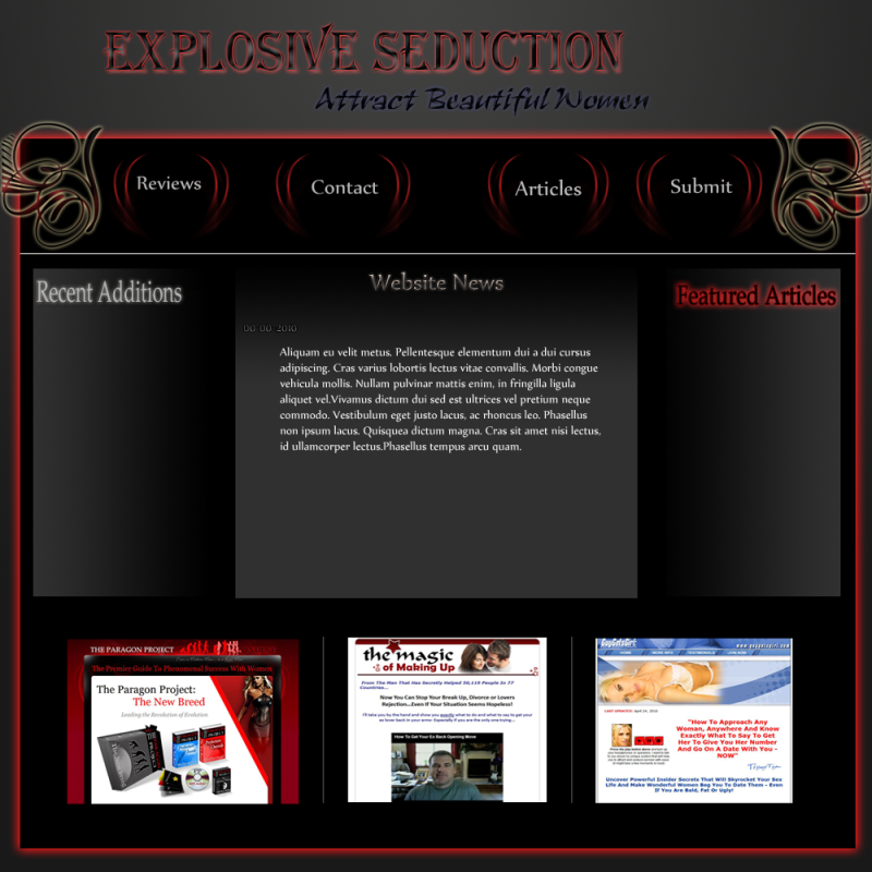
Revision Number 1:

Opinions? Thanks.Last edited by Jorge; 05-05-2010 at 11:44 PM.
-
05-05-2010 04:12 AM #2
-
05-05-2010 07:41 AM #3Be a man of Value.
- Join Date
- May 2008
- Gender
- Location
- Pico Rivera
- Posts
- 529
- Likes
- 22
 Originally Posted by Loaf

Exactly what I was aiming for... =/
Anything you would like to advise?
Thanks.
-
05-05-2010 07:47 AM #4
I think the header could be shifted to be a little more center (it looks too far to the left) and I dislike the use of gradient in the main content area.
-
05-05-2010 08:34 AM #5Gentlemen. Ladies.

- Join Date
- Mar 2007
- Gender

- Location
- Right here... Reputation: 9999
- Posts
- 4,902
- Likes
- 473
- DJ Entries
- 4
Latin? This wouldn't happen to have been made in iWeb would it?
-
05-05-2010 12:54 PM #6Light Rail Transit
- Join Date
- Dec 2009
- LD Count
- 17
- Gender
- Location
- Toronto
- Posts
- 299
- Likes
- 34
- DJ Entries
- 2
I like it. Is the code standards-compliant?
-
05-05-2010 01:20 PM #7MY Achievements:


- Join Date
- Mar 2010
- LD Count
- 5000+
- Gender
- Location
- US
- Posts
- 579
- Likes
- 103
- DJ Entries
- 6
It is nice, but I do agree with Loaf. It does look like a gaming forum/website more than a dating website. But if thats what you are looking for, you are doing very well

-CV
-
05-05-2010 03:09 PM #8
Sorry if it seems like I'm tearing this apart brick by brick but here it goes

The text at the top is not attractive-- when I scan my eyes right to the page I see "Attract beautiful women" better than I do the title. Those random blurred parts around the text seem pretty bad to look at to me-- if I were you, I'd first off center the main title, make the text bolder around the outside. Those feathered lighter tones really offset the ability for it to contrast with the background.
And speaking of the background, the header's background is okay, BUT, I would make it less linear like the linear gradient it is by adding some inner glow of some sort to better blend it's linear pattern.

The black box underneath is okay, and I guess the glowing patterns are okay, but it would be better if the pattern was lighter with then a dark glow, instead of the opposite.
Now, the gradients... they've gotta go. The way you have absolute falloff with them (so they fade to the blackest of blacks) really doesn't look good when fading from that light gray. I'd do something like I said with the header's background:

Much cleaner looking, easy to read from.
But, for future reference just remember-- don't use such intense gradients if they're going to be for a background. Especially ones that go from a really light to a really dark tone-- lighter text will look good in dark areas but bad in light ones, and vice-versa for dark text.
That's just what I think of course hehe. Hope that helps.
-
05-05-2010 05:39 PM #9Be a man of Value.
- Join Date
- May 2008
- Gender
- Location
- Pico Rivera
- Posts
- 529
- Likes
- 22
Thank you guys! You all have great ideas and improvements, I will respond to each individual who requires a response later in the day! Once again I appreciate it! =)
-
05-05-2010 07:53 PM #10Banned
- Join Date
- Apr 2007
- Location
- Out Chasing Rabbits
- Posts
- 15,193
- Likes
- 935
Using iWeb? That text in the middle looks like iLatin.
iWeb is for making personal webpages, not professional sites. If you want to be taken seriously as an online dating site, I would invest the couple grand to get DreamWeaver.
-
05-05-2010 08:35 PM #11Be a man of Value.
- Join Date
- May 2008
- Gender
- Location
- Pico Rivera
- Posts
- 529
- Likes
- 22
No I am not using iWeb, the content in the middle is just "filler content" I just threw in there for the meantime. This is just the layout I made in photoshop.
-
05-05-2010 08:45 PM #12Lucid Master of Flight Achievements:


- Join Date
- Dec 2009
- LD Count
- untouchable
- Gender
- Location
- The sky
- Posts
- 1,362
- Likes
- 211
- DJ Entries
- 7
Spenner hit it for you.
No gradients, avoid these. Look for better solutions to blending.
I would add some aesthetic pieces but not too many. The background color kills the whole page and makes it hard for the rest of the page to stand out. A lighter color would do well here.
If you follow spenner's suggestion for the middle section, it might be better to adjust the text to a more centered position to bring it away from the inner glow.
You wanna always keep your text easy to read, as this is you main mechanism for conveying your message.
The text meant to act as the banner does need to be congruent and aligned either to the left, right, or center.
You might also think of adding a banner instead of just text, but that's just a suggestion.
That's all i've got for now...
"MementoMori, the lucid machine"
"There's nothing better than knowing what it's like to fly like superman. Being fully aware of the air whipping by you, controlling every movement of every single atom in your body with a single thought. It's real freedom, and there's not a word good enough to describe it, so I'll just call it dreamy for now."
-
05-05-2010 08:53 PM #13
Yes, a banner would be a good idea. Also if you have even the simplest of logos to get the message across, it would help to incorporate that into the banner as well.
-
05-05-2010 11:03 PM #14Be a man of Value.
- Join Date
- May 2008
- Gender
- Location
- Pico Rivera
- Posts
- 529
- Likes
- 22
I originally wanted it to be like the way it is now. However, after looking at it closely I completely agree. Originally Posted by Loaf
I will move it in my next revision.
No, as I stated Ninja, it's just filler content I threw in there just to get an idea. I made this layout in photoshop. Originally Posted by slayer
Thanks for your input. Originally Posted by ClearView
Thank you! I really like your ideas and I am currently putting them into use! I will update this thread and show you the improvements! Thanks again! Originally Posted by Spenner
Thank you, I am taking his suggestions and it is looking much better. Thanks again! Originally Posted by MementoMori
-
05-05-2010 11:14 PM #15You do know the whole lorem ipsum thing isn't iWeb specific. Originally Posted by slayer
-
05-05-2010 11:45 PM #16Be a man of Value.
- Join Date
- May 2008
- Gender
- Location
- Pico Rivera
- Posts
- 529
- Likes
- 22
Just uploaded New Addition
-
05-07-2010 01:23 AM #17Gentlemen. Ladies.
- Join Date
- Mar 2007
- Gender
- Location
- Right here... Reputation: 9999
- Posts
- 4,902
- Likes
- 473
- DJ Entries
- 4
Well no I didn't. The only applications I've used for making websites was Dreamweaver and iWeb which I had to use in my computers class. Originally Posted by Loaf
I love Latin. I want to learn it some day...


Similar Threads
-
Anyone able to design web-pages?
By ExoByte in forum The LoungeReplies: 2Last Post: 08-17-2008, 11:15 PM -
Design Coding
By Ynot in forum Tech TalkReplies: 4Last Post: 03-28-2008, 06:25 PM
 Posting Permissions
- You may not post new threads
- You may not post replies
- You may not post attachments
- You may not edit your posts
Bookmarks