Hey all - it's been a while since I posted any art - there was crappy thread detailing my first attempts at learning to use a tablet way back, but I sort of gave up and the tablet sat untouched for about a year, until one day I decided to pick it up and get back to work on digital painting. Meanwhile I had gained some skills at retouching photographs using mostly Lightroom and a little photoshop, and suddenly it occurred to me - since one of my biggest problems with my paintings (both digital and traditional) was color, I ought to be able to use the same technology I had learned and apply it to my paintings - I mean durr! Big forehead slap moment.
So I busted out the 2 most promising of my old paintings and went to work on them:
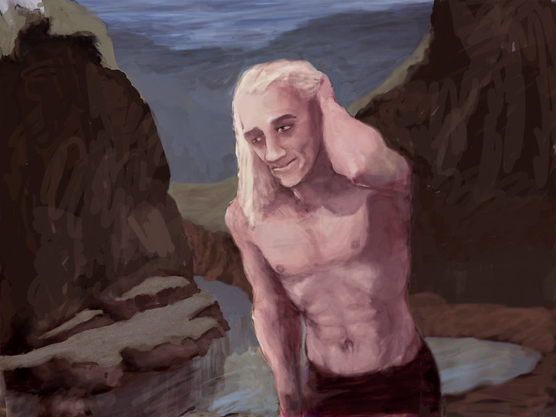
You might remember this one from an earlier incarnation:
As I said, I was having issues with color - basically my colors were way too saturated and brilliant and they clashed rather badly - no color harmony to be found. I *THOUGHT* I was doing pretty well, but then I looked at a bunch of paintings by Frank Frazetta (who I'm studying as a master of classical figurative art and who I'm attempting to sort of emulate for a while - to stand on the shoulders of the giant of all giants and get a better view of the territory from up there) and his paintings weren't actually anywhere near as intense color-wise as I remembered them being!! And they're often considered to be quite vivid and colorful ~ !! 
But I quickly realized his strategy is to use very desaturated earth tone colors for most of a painting (which looks very Renaissance) and then just use one well-chosen color at greater intensity so it stands out - that way no clashing color disharmony! Brilliant (pun intended)!!
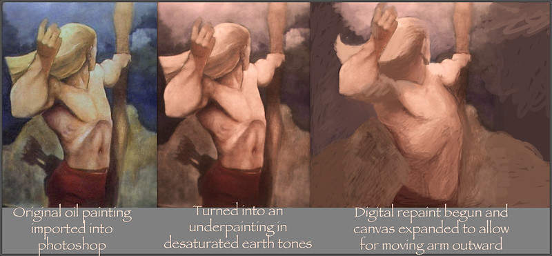
So that's where I started - I used photoshop to desaturate and bring my stuff down to earth (tones that is - nyuk nyuk!) and get those outrageous colors under control. In fact many painters throughout history are known to start with a monochromatic underpainting in browns in order to work out the value plan - get the lights and darks in the right places first, and then start working in the colors - turns out Master Frazetta does that one too, so who am I to second guess it? This one was already in color, so I just detoxified it a ways and then reworked the background and did a bit of fixing up on the figure - that pose is seriously lame though (it's actually the first thing I drew in a massive impatient rush as soon as I got ahold of my tablet and have been developing it ever since).
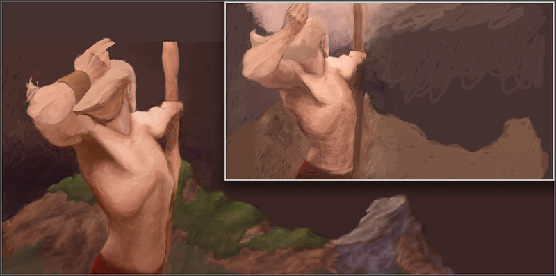
Then there's this one:
This is the one where I'm reeeaaallly stretching my wings!! As you can see in the montage below, it started from an oil painting I did many years ago that was bad not only in terms of color but also the anatomy was awful!! I'm ashamed now when I look at it - and I'm not entirely sure how I got the proportioning/anatomy so screwed up - even then I actually knew better. I believe I was pretty well flabbergasted by the actually quite difficult pose with all its extreme foreshortening and the upraised arm and strongly compressed elbow joint. These are all high difficulty items - especially for an amateur like me!
But as you can see from the evolution progression, he shaped up rather nicely. Though there were some pretty weird stages along the way - I only picked a few highlights to show here. Suffice to say - along the way I've learned hella lot about how to use photoshop to reshape and splice things together and do all kinds of plastic surgery! I've literally moved that upraised arm dozens of times, distorted it and stretched it out and pushed parts of it this way and that... in fact it became a lot like working a clay sculpture. I've put a lot of hours into this over the last 3 weeks, and I'm amazed at the progression, in both the painting and in myself as an artist. As Onieronaut mentioned on his art thread the other day, once you really figure out how to use it, photoshop allows you to do far better than you can in traditional media!!
|
|


 165Likes
 LinkBack URL
 About LinkBacks


 Reply With Quote
 Posting Permissions
Bookmarks