


 LinkBack URL
 About LinkBacks


 Reply With Quote
Well, with or without more saturation, the skin is good. |
|
Results 26 to 50 of 74
Thread: Forum Layout
-
08-24-2007 12:40 PM #26Member Achievements:


- Join Date
- Nov 2004
- Gender

- Location
- Bay Area, CA (USA)
- Posts
- 848
- Likes
- 1
 Originally Posted by born_2_kill


Holy damn!
I want to have intercourse with that banner, but I don't how I could possibly do that until it's officially implemented. Really... the logo is amazing! 9.5/10! (there's always room for improvement, but in that case, I honestly have no idea how it could be improved) Anyway, it looks great with the theme you have there, it matches. It might look weird if it was implemented on the current theme though... the darker blue wouldn't match as much with the lighter blue of the current theme.
As far as the rest, here is my personal opinion
Title bars (don't know what's called, but the places where it says "keybase general forums" and "keybase transaction"):
It does look very nice, but still has a bit of techy-feeling to it. Don't know what causes that... maybe the edgy and sudden contrast of "cylinders" near the edges, where the circle is, and where the darker blue meets the lighter blue, if that makes any sense. Maybe a smoother transition would make it a bit more dream-like, but don't take my word for it.
Forum title icons (icons for "keybase news," "weekly updates" etc)
Also looks very nice, but could use some improvement to make it a bit more dream-like as well. It might be very hard to make something so simple as an icon appear dream-like or surreal though.
Nonetheless, like I previously said... the theme might not be very dreamlike, but its still much more appealing than the current theme. As far as the new logo you made... BRAVO! It looks amazing...
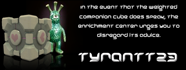
Adopted: mystqjaq
Raised by: Seeker
My Dream Journal | My Aquarium | Myspace | Facebook Me | Stickam
-
08-24-2007 12:48 PM #27Wanderer

- Join Date
- Sep 2005
- Gender
- Location
- On a journey
- Posts
- 2,039
- Likes
- 4
-
08-24-2007 04:52 PM #28with a "gh"

- Join Date
- Mar 2007
- Gender
- Location
- In marital bliss. Yup, I got married on Sept 26th, 2009!
- Posts
- 2,416
- Likes
- 2
Why are we not using Tornado Joe's cool animated banners? WHY??? WHY??? The night one is awesome!
Feast your peepers upon these.
-
08-24-2007 05:07 PM #29Boom! Achievements:


- Join Date
- Oct 2006
- Gender
- Location
- under your bed haha Posts: -134
- Posts
- 1,012
- Likes
- 2
what about these by tornado joe
http://www.dreamviews.com/community/...6&postcount=75
-
08-24-2007 05:23 PM #30I *AM* Glyphs! Achievements:

- Join Date
- Sep 2006
- Gender
- Location
- UCT or home - depends what time you catch me :P
- Posts
- 2,130
- Likes
- 3
Is any of this going to be official? I hope so ...
"There are people who say there is no God, but what makes me really angry is that they quote me for support of such views." ~Albert Einstein
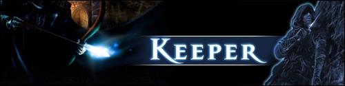
Ask me Way Back Your Soul My Dream Story (Chapter two UP!)
-
08-24-2007 06:33 PM #31Callapygian Superstar

- Join Date
- Jan 2007
- Gender
- Location
- Budapest
- Posts
- 1,901
- Likes
- 11
I like Tornado Joe's banners apart from a few things:
1. Why is part of Dream hidden behind a mountain? Bring it to the forefront.
2. Too much of a space between Dream and Views.
3. The way the text appears on the banners is a bit... tacky
4. Same for the stars on the Night banner.
Time based Banners are the way to go in my humble opinion.*............*............*
-
08-24-2007 09:07 PM #32Senior Pendejo

- Join Date
- Jan 2005
- Gender
- Location
- Rock n Roll Capital
- Posts
- 2,658
- Likes
- 26
Hey, thanks for the props guys - but those banners are a bit outdated. I designed those back under the old administration and had the old banner graphic. Some of the direction came from the Icedawg, so I'm not sure we'd continue on that path now. Guess we should ask Asher if he has any specs for a new design.
Looking back at those I'd definitely change a few things, including some of those pointed out by goldney.
Keep the designs coming. The more ideas come in, the better the final result could end up! With a little direction I'd mock up some more. But so far there hasn't been an official "hey, we need a new banner soon" request, so...
-
08-25-2007 08:06 PM #33Top of the mornin' to ya! Achievements:

- Join Date
- Aug 2007
- Gender
- Location
- Dartmouth, Nova Scotia
- Posts
- 75
- Likes
- 0
 Omfg
Omfg
ZOMG
Those banners (both the animated and non animated) are amazing. why dont we use tornado joes banners and born 2 kills layout.
C'mon lets do it now! right now!
if people dont like it we can always fix it or take it down. but i dont see how someone wouldn't like those. DILD: 7 WILD: 0.5

-
08-30-2007 09:24 PM #34Eprac Diem

- Join Date
- May 2006
- LD Count
- i/0
- Gender
- Location
- Canada
- Posts
- 1,957
- Likes
- 52
I always wanted to learn how to use the displacement map filter....
clicky clicky
Put your mouse over it. Possible effects for the banner? =O
-
08-30-2007 11:43 PM #35
I'm going to be able to do this stuff by june. i know thats forever away, but im excited. Maybe, if we dont have a new skin by then, I can help! Hopefully itll be sooner then that, but seeing as I dont control the class....
-
08-31-2007 01:17 AM #36with a "gh"
- Join Date
- Mar 2007
- Gender
- Location
- In marital bliss. Yup, I got married on Sept 26th, 2009!
- Posts
- 2,416
- Likes
- 2
I love the effect! Originally Posted by arby
-
08-31-2007 02:14 AM #37Member Achievements:


- Join Date
- Oct 2003
- Gender

- Posts
- 4,668
- Likes
- 21
Agreed... I love that banner, but the text has GOT to be fixed. Drop Shadow? Embossed? Italicized? Not the greatest design. Get a bunch of banners with the same background, different font. It's important for the banner to match the color scheme of the forum, and your banner and color scheme match up very nicely, so I like it. With the little funky effect, I think it would be pretty nifty.
-
08-31-2007 04:33 AM #38The Illuminated One

- Join Date
- Jul 2007
- Gender
- Location
- Pyramid.............. Job: Webmaster
- Posts
- 433
- Likes
- 3
i made that banner just to test the new photoshop which i bought, i will work on a new one probably today
and spend more time doing it
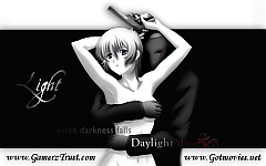
Proud Owner & Co-creator of GamerzTrust.com & Gotmovies.net
-
08-31-2007 04:51 AM #39...Lost...

- Join Date
- Aug 2007
- Gender
- Location
- texas
- Posts
- 237
- Likes
- 3
Tornado joes banners are amazing....wow great work!!! Born_2_kill i love the layout man great work!
Believe nothing,
no matter where you read it, or who said it, no matter if I have said it, unless it agrees with your own reason and your own common sense. - Buddha
Adopted By - Adam
-
08-31-2007 05:47 AM #40The Illuminated One
- Join Date
- Jul 2007
- Gender
- Location
- Pyramid.............. Job: Webmaster
- Posts
- 433
- Likes
- 3
Heres a new update :

I changed the logo and added more contrast to it im still developing it so this one is a preview

Edit : Removed the person + added a new backroundLast edited by iLight; 08-31-2007 at 06:17 AM.
Proud Owner & Co-creator of GamerzTrust.com & Gotmovies.net
-
08-31-2007 06:10 AM #41Member Achievements:
- Join Date
- Oct 2003
- Gender
- Posts
- 4,668
- Likes
- 21
I don't like the person, and I think the font needs more contrast to the rest of the banner. Also, a "lucid dreaming forum" subtitle below it could add some more interest, think about that. That is what we used to have.
-
08-31-2007 06:12 AM #42...Lost...
- Join Date
- Aug 2007
- Gender
- Location
- texas
- Posts
- 237
- Likes
- 3
Ya the person isnt a good idea other than that i really like the new banner!
Believe nothing,
no matter where you read it, or who said it, no matter if I have said it, unless it agrees with your own reason and your own common sense. - Buddha
Adopted By - Adam
-
08-31-2007 06:44 AM #43The Illuminated One
- Join Date
- Jul 2007
- Gender
- Location
- Pyramid.............. Job: Webmaster
- Posts
- 433
- Likes
- 3
Fix up :

Please rate my previous post
Proud Owner & Co-creator of GamerzTrust.com & Gotmovies.net
-
08-31-2007 11:53 AM #44Member Achievements:
- Join Date
- Oct 2003
- Gender
- Posts
- 4,668
- Likes
- 21
Naw, that background is no good. For reasons other than "cuz"...
1) One important thing in a design scheme is to repeat colors throughout. That orange and purple (especially the orange) is so like "wtf why is that there." It doesn't fit in , at all. Even without it though, I really prefer the other picture. The reason being it fits the color scheme very well. There are the whites, to the light blues, to the navy on the left and right sides of the bar things. But the text still needs work, for mroe contrast.
-
08-31-2007 12:10 PM #45!DIREKTOR!

- Join Date
- Jan 2007
- Gender
- Location
- Aquanina's closet
- Posts
- 5,195
- Likes
- 34
To be honest, I think just a normal banner would look good, I think the effect is cheap looking? Originally Posted by arby
I think this looks too much like a computer forum? Like it belongs on a techy site?I still love this site Originally Posted by born_2_kill
 http://www.dreamviews.com/oldforum/index.php
-
08-31-2007 01:22 PM #46Member
- Join Date
- Jan 2007
- Gender
- Posts
- 2,893
- Likes
- 2
I want the forum design back that was here when i first joined, i liked the user profile aswell, how you could view them, see who viewed your profile, have a cool looking buddy list, it was awesome, can hardly remember what it looked like but i liked it. Bring back the old design and skin!
In terms of a new banner/logo type thing, i think that it should be kept basic, keep it basic but make it look stylish aswell, too many things in a banner can make it look crowded, basic but stylish would look good, just my views on it.
-
08-31-2007 01:27 PM #47Eprac Diem
- Join Date
- May 2006
- LD Count
- i/0
- Gender
- Location
- Canada
- Posts
- 1,957
- Likes
- 52
Yeah, first try with displacement map. Didn't turn out as nice as i'd hoped. Probably because I just spammed movie clips with random alpha to make the map. XD Originally Posted by Adam
I toned it down a little and set it to auto-wander (just C&Ped my sig code to use as example). This way its more of a recessive effect and makes the banner seem a little dreamier. Here
-
08-31-2007 02:16 PM #48Senior Pendejo
- Join Date
- Jan 2005
- Gender
- Location
- Rock n Roll Capital
- Posts
- 2,658
- Likes
- 26
Hey, you know what Arby, I like that better. Only one little knit-pick and I'd vouch for it - have the effect wash over at random intervals in a ration of about 10 to 1. I just think it would have much more impact if the person loaded the page, started reading a thread, then all of a sudden (after a couple seconds or more) this weird ripple appeared in the masthead - then just vanish!
Leave the reader goin "uh, what the fuck was that?"
Adam - I believe that site was the product of a different software package we were trying out at one time. If someone could translate that look and graphics into the type of system we have now, I don't think you'd get much resistance (I like that look too). Maybe with just a few tweaks so it doesn't look so... rigid or mechanical.
nice work all
-
08-31-2007 02:25 PM #49!DIREKTOR!
- Join Date
- Jan 2007
- Gender
- Location
- Aquanina's closet
- Posts
- 5,195
- Likes
- 34
Lucid Seeker, check my post there is a link to the old forum there.
Joe I know what you mean, I am working on a design for the new forum, trying to replicate the old one, but making it newer if that makes sense?
-
08-31-2007 03:21 PM #50Eprac Diem
- Join Date
- May 2006
- LD Count
- i/0
- Gender
- Location
- Canada
- Posts
- 1,957
- Likes
- 52
I like the way you think Joe =)
Here ya go
No where near perfect (Probably best to reduce the ripple radius and tweak some other stuff) but its decent.
[EDIT] Just fooling around a little. got this.
and, that with delay intervals.. thisLast edited by arby; 08-31-2007 at 03:29 PM.


 Posting Permissions
- You may not post new threads
- You may not post replies
- You may not post attachments
- You may not edit your posts
Powered by vBulletin™
Copyright © 2025 vBulletin Solutions, Inc. All rights reserved.
Search Engine Friendly URLs by vBSEO
Copyright © 2025 vBulletin Solutions, Inc. All rights reserved.
Search Engine Friendly URLs by vBSEO
Bookmarks